Berkeleytime
AT A GLIMPSE
DESIGN PROCESS
THE DISCOVERY
DEFINING CHALLENGES 01
DEFINING CHALLENGES 02
Initial Explorations
I experimented with having the text 'Decal' in the main heading, subheading, and categories. However, after briefly testing with users, I learned that students are often browsing through the course catalog so quickly that they're only skimming the heading. We agreed that the information that this is a 'Decal' course should be in the same hierarchy as the heading. Even so, however, many students felt it was hard to quickly distinguish it from normal courses. We needed for a way for Decal courses to be more visually distinguishable from normal courses.
TIMELINE
Sept - Dec 2024
CONTRIBUTION
User Research, Prototyping, Handoff
TEAM
Team: 2 Designers, 3 Engineers, 1 UXR
Decal Tag - Making it Pop
To make Decals more visually distinct, I experimented with a Decal sticker UI. Initially, I used a CTA color (blue) in the first few iterations, but realized that CTA colors should be reserved for more critical information and actions. Using it for the sticker could diminish the impact of other CTAs.
Evaluating against Relevant Principles
For testing, I showed students the view of how each course card fits into the existing catalog. To cross-check their opinions and reduce bias, I created a scale using the relevant principle derived earlier (Be Straightforward), and asked students to rank how easy it is to identify each iteration as a Decal course as opposed to a normal course. Although the bright-blue iterations were the clearest, they stood out too much, giving the information that a course is a Decal higher priority than necessary.
DESIGN EXPLORATION 01
DESIGN EXPLORATIONS 02
Collaborating closely with Engineering
We adopted a quick, iterative UX approach that emphasized short and low-fidelity cycles, encouraging frequent feedback from the engineering team. I introduced low- to mid-fidelity prototypes during weekly alignment meetings with the engineers to quickly visualize core components and workflows to gather constraints and ideas early on. Adopting this approach ensured frequent team-wide feedback, which significantly reduced time spent on less productive directions while revealing clearer constraints during each iteration. I aggregated team feedback to determine what's best for the users and repeated this iterative process.
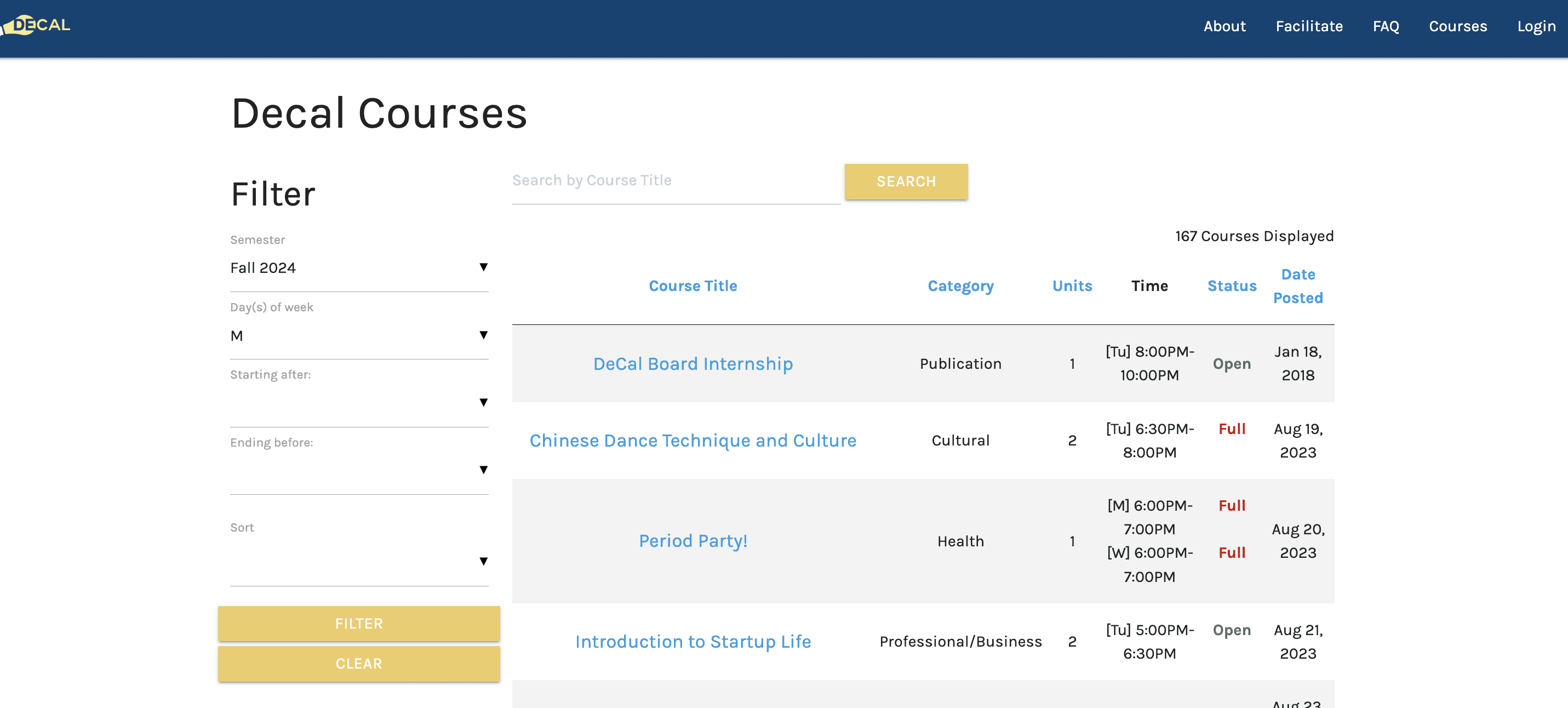
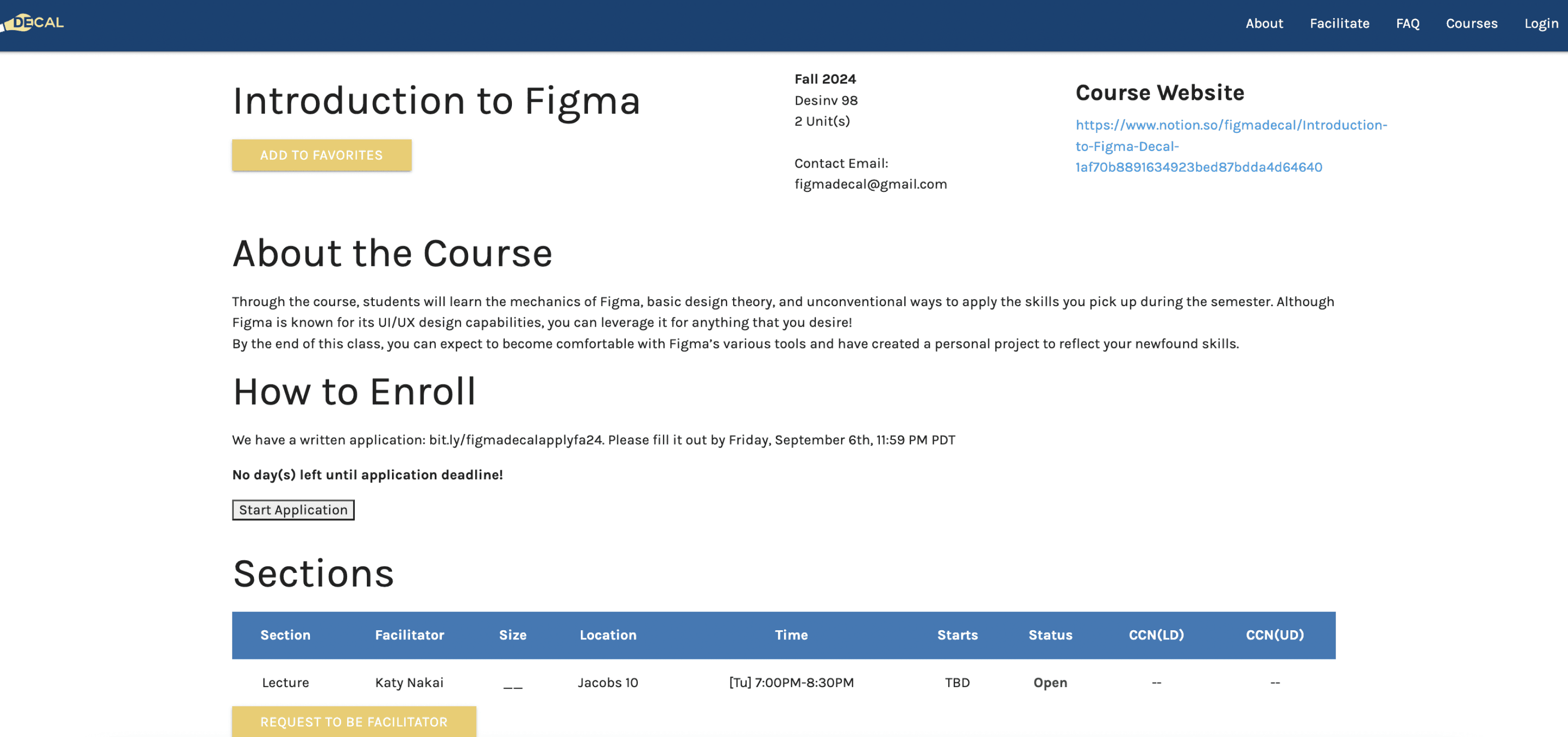
Currently, Decals exist on a separate platform.
Students turn to Berkeleytime when trying to decide and find what courses to take for the upcoming semester. However, currently, students have to navigate to a separate platform to look up information related to Decals.


Current Decal Platform
Design Principles
Understanding how students currently use Berkeleytime to search for Decals helped us develop a shared understanding of what the ideal experience could look like. Through interviews about students' experiences with Berkeleytime and course scheduling overall, I created a set of experience principles to determine the overall feeling and expectations of the design and guide our decisions.
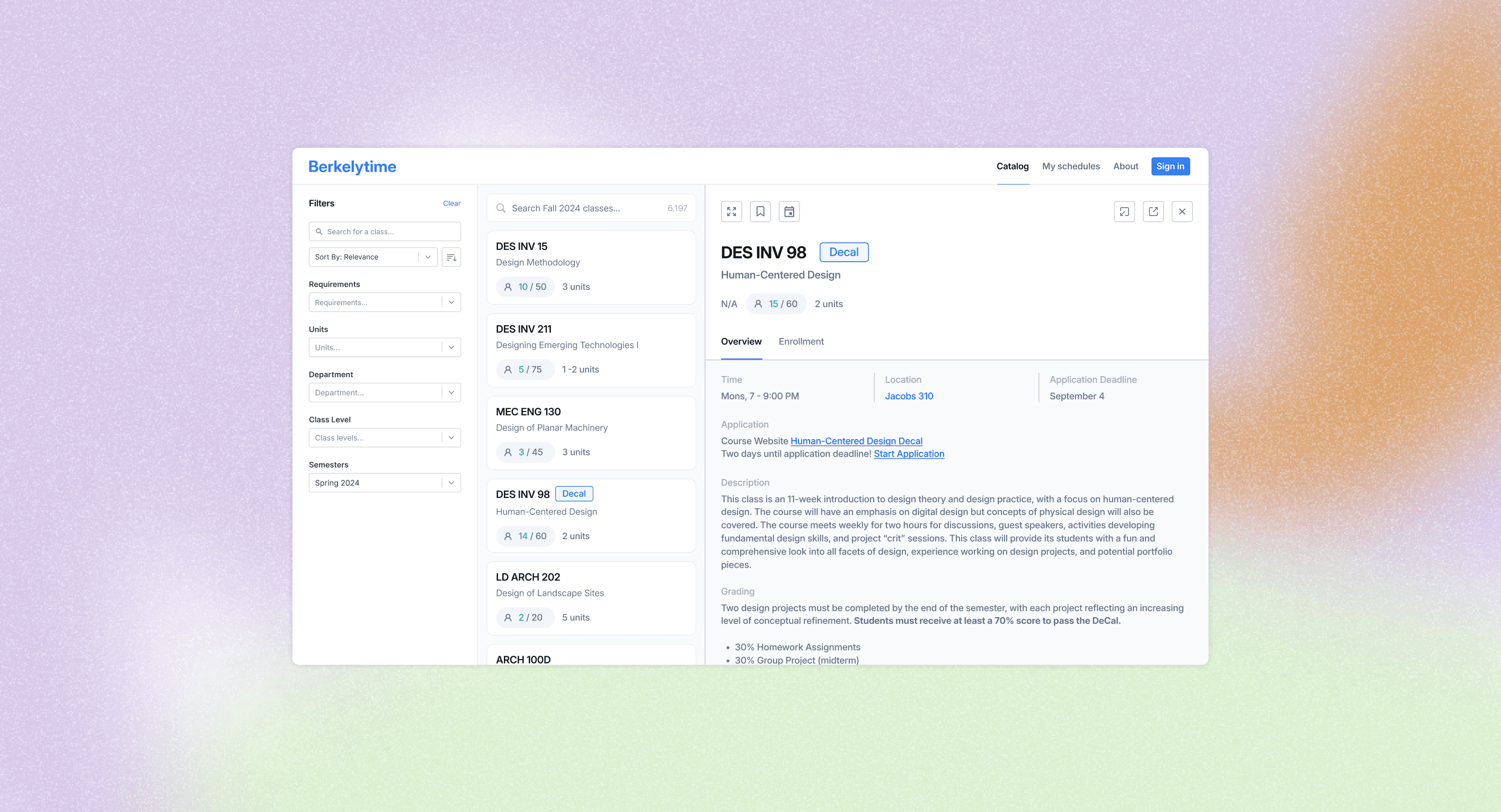
Berkeleytime is a platform used by 45,000+ students at Berkeley to browse and discover courses. My team and I were tasked with integrating student-led courses called 'Decals' onto the current platform. I designed how 'Decals' would be integrated into the current Berkeleytime platform. Parts of my process included conducting user research and usability testing, aligning with engineers, prototyping, and iterating.
FILM 198 Decal
Filmmaking Basics
Decal Course
N/A
15 / 60
1 unit
FILM 198
Decal: Filmmaking Basics
N/A
15 / 60
1 unit
FILM 198
Filmmaking Basics
Decal Course
N/A
15 / 60
1 unit
'Decal' in Categories
Iteration 01
'Decal' in Subheading
Iteration 02
'Decal' in Heading
Iteration 03
Key Problem
Text alone was not enough for students to quickly distinguish Decals from normal courses.
Decal Tag next to Heading
Decal Tag in Categories
Iteration 02
Decal Tag on Right Corner
Iteration 03
FILM 198
Decal
Filmmaking Basics
15 / 60
1 unit
Iteration 01
FILM 198
Filmmaking Basics
Decal
N/A
15 / 60
1 unit
FILM 198
Decal
Filmmaking Basics
15 / 60
1 unit
Most easy to identify it is a Decal course.
Least easy to identify it is a Decal course.
100
50
75
25
0
FILM 198
Decal
Filmmaking Basics
15 / 60
1 unit
FILM 198
Filmmaking Basics
Decal
N/A
15 / 60
1 unit
FILM 198
Decal
Filmmaking Basics
N/A
15 / 60
1 unit
FILM 198
Decal
Filmmaking Basics
15 / 60
1 unit
FILM 198 Decal
Filmmaking Basics
15 / 60
1 unit
FILM 198
Decal
Filmmaking Basics
15 / 60
1 unit
FILM 198
Decal
Filmmaking Basics
15 / 60
1 unit
Scale of how easy it is to identify a course is a Decal
Optimal Range
Key Insight
Going too far on the scale might be counterproductive for the goal of being visually distinguishable, yet unobtrusive.
Picking apart the Course Card
To get started, I analyzed the existing hierarchy of information on the course card. This was helpful for understanding why each piece of information was positioned within its respective hierarchy and for considering the priority of the information that a course is a Decal course.
1
Main Heading: Inform users the course title at a glance.
2
Subheading: Shows the full course title in more detail.
AEROSPC 1A #001
Foundations of the U.S. Air Force
15 / 60
1 unit
3
Categories: Provides additional information about the course in pills.
Decal Tag - Striking a Balance
Considering the previous points about balance and reserving the CTA color, I explored using a lighter shade of blue for the sticker instead. Additionally, placing the sticker in the top-right corner felt disruptive to the browsing experience, as students primarily skim the left side of the catalog. The top right corner is typically reserved for important actions, so we decided the optimal placement for the sticker would be near the main heading.
Decal Tag on Right Corner
Decal Tag in Categories
Iteration 05
Decal Tag next to Heading
Iteration 06
Iteration 04
FILM 198
Decal
Filmmaking Basics
15 / 60
1 unit
FILM 198
Filmmaking Basics
Decal
15 / 60
1 unit
FILM 198
Decal
Filmmaking Basics
15 / 60
1 unit
Anatomy of the Existing Course Page
I then analyzed the existing information hierarchy of Decal pages to determine the most intuitive placement for each piece of information. Analyzing the existing structure was useful in helping me evaluate where each piece of information would be most logically and effectively surfaced.
Considering Contextual Information
Understanding the context in which students browse for Decals, I learned that they often seek these courses to meet a 1- or 2-unit requirement. Therefore, we needed to strike a balance where the Decal card is easily recognizable yet unobtrusive, ensuring it does not disrupt the browsing experience for students not specifically searching for Decals.
How can we display exactly what Students are looking for?
My challenge was to think about what information we would display on each tab and how to display it. To learn about what information was important to students, I did a round of testing with high-fidelity prototypes but quickly realized that low-fidelity prototypes were more effective. Lower-fidelity prototypes made students feel the design wasn’t finalized, encouraging them to share more. I asked students to think out loud what information they expected to see, and asked them to rank the importance of each tab from least to most.
LEARNINGS
Time, location, short description of course, grade weighting, estimated workload, and how “competitive” it is to get in.
Overview
What Students Look for on each Tab
Low-Fidelity Testing
Link to application, application process.
Enrollment
Students take Decals for all sorts of reasons, such as fulfilling a unit requirement and professional development, so it would be hard to provide metrics such as "Usefulness". Yet, many students indicate that they rely on word-of-mouth when considering whether to take a Decal.
Ratings
AFRICAM 116 #001
Slavery and African American Life Before 1865
N/A
15 / 60
4 units
25537
Overview
Sections
Enrollment
Grades
Time
MW, 10 - 11:59 AM
Location
Social Sciences Building 166
Instructor
Ula Taylor
Description
This course will examine the origins of the African slave trade, and explore political, economic, demographic and cultural factors shaping African American life and culture prior to 1865.
1
Main Heading: Inform users the course title at a glance.
Subheading: Shows the full course title.
2
Tabs: Provides additional information for students who are interested in learning more.
3
4
5
6
Categories: Displays additional information about the course in pills.
Breakdown: Provides the most crucial logistical information at a glance on the Overview tab.
Description: Provides more detailed description of the course.
01 Be the go-to platform.
Students often navigate multiple external platforms, like Reddit, Rate My Professors, and CalCentral, to gather course information.
We should aim to consolidate all desired information in one place.
02 Be trustworthy.
When reviewing a potential course, students have to check multiple details, requiring cross-checking on other platforms.
Improving information accuracy would help establish greater trust.
03 Be personal.
When choosing classes, students consider several factors, like grade distribution, professional growth, and personal wellness.
The information provided should support students in making the best decision for themselves.
01 Be easily navigable.
Enrolling in courses feels stressful, especially when a planned course fills up last minute, forcing students to find alternatives under time pressure.
The interface should be easy to navigate, allowing students to move between sections, with information that feels connected.
02 Be straightforward.
Scheduling and enrolling in courses can feel tedious.
We should be straightforward and present essential information concisely and upfront.
03 Be useful.
Students see certain features, like grade distribution, as essential.
Reviewing information for multiple courses at once can lead to cognitive overload, so we should prioritize information that is genuinely useful to them.
Experience
Content
Which features have the highest priority?
Prioritizing against user research and technical feasibility, I aligned with the engineering team to determine the features with the highest priority. We narrowed down to two things to design and implement: how Decals will show up on the course Catalog, and what information will be displayed when students click on a Decal course.
Design Challenge 01
How should Decals show up on the course catalog as students are browsing through courses?
Design Challenge 02
What information should we display on the Decal course page?
Aligning with Engineering Constraints
In alignment with the engineering team, I learned that each iteration requires similar engineering effort, so it’s best to base the decision on user testing.
What are 'Decals'?
DeCals at UC Berkeley consists of student-run courses where students create and teach classes on diverse topics outside the University curriculum. Each semester, over 150 DeCal courses are offered, covering subjects from Taiwanese Language to Harry Potter and Philosophy, with around 3,000-4,000 students participating!
Pushing the Boundaries
I learned the importance of initially pushing the boundaries of creativity and functionality when working with engineers. By presenting ambitious concepts that best tackle the obstacles faced by users, I could challenge what’s possible. While this approach often led to “push-back” from engineering due to technical constraints, I found that this tension was actually productive. It allowed us to collaboratively identify the core experiences that mattered most to the users.
Prioritizing Feedback
I learned the importance of prioritizing feedback to be as effective and actionable as possible. Rather than asking for open-ended feedback—which can often lead to broad ideas—I focused on asking for feedback specifically related to areas of uncertainty in my design decisions. For example, if I was unsure about the feasibility of a particular interaction, I would ask engineers to weigh in on that specific component. This allowed me to address potential roadblocks early on and facilitated more targeted discussions on whether or not adjustments were necessary.
Effectively Collaboration with Engineers
High-level Approach
Working within the constraints of an established design system challenged me to design interactions that felt congruent with the existing design language. This taught me to think more broadly in terms of design systems and components. Rather than focusing solely on the immediate visuals and functionalities of components, I learned to evaluate new components not only for their current purpose, but also for how they could be reused or adapted across other parts of the interface. This helped me prioritize scalable solutions that could streamline development and maintain more visual coherence throughout the Berkeleytime website.
Design Systems Thinking
Being curious and asking questions.
To get started on imagining how Decals will be integrated onto Berkeleytime, we conducted a survey to gather quantitative data on how students currently navigate the process of discovering and enrolling in Decals. This was to help us identify core experiences that we could improve and high-level problems that we could tackle.
What are the primary ways you’ve learned about Decal course offerings?
Current Decal Website
Time & Location
Course Content
Course Topic
Alignment with Schedule
Word of Mouth
78.9%
68.4%
84.2%
78.9 %
77.8 %
69.5 %
Key Questions & Top 2 Answered Responses
What are the important considerations when you’re enrolling in a Decal?
What would interested you in taking a Decal?
Consideration 01
Students turn to online platforms to learn and share information about Decals.
Consideration 02
Students want to easily see how Decals fit into their existing schedule.
Translating data into insights, we learned that…
Integrating Decals onto Berkeleytime
Now, students can easily discover Decals on the existing Berkeleytime platform. The Decal tag help students distinguish decals from regular professor-taught classes while also being visually congruous with the rest of the catalog interface. (info from https://hcd-decal.org/)
How can we reflect the mental models of how students store information?
After mapping out the hierarchy, I identified questions around how to present certain information and whether some elements should be included at all. This process involved thinking critically about the relevance and placement of each element to ensure that the most important information was easily accessible. This led me to consider how to reflect students' mental model and the visual emphasis needed for each item to create a hierarchy that felt clear.
Tabs
Avg Importance (1 as most, 5 as least)
1.25
“This would show the most important things, so description of the course, times and location, and what type of assignments to expect.”
“This wouldn’t be needed, since Decals have no sections. There’s just one time.”
“Decals are Pass/No Pass, so it wouldn’t really make sense to have a grade distribution.”
“This could be helpful since a lot of people depend on word of mouth. This could include information like average workload and difficulty.”
5
5
2.75
Key Quote from Users
Overview
Grades
Sections
Ratings
“This can provide more information on the enrollment process, like the application timeline and process.”
1.75
Enrollment
How important does each Tab feel to students?
I determined the importance of each tab by taking an average of the ratings provided by students. The results below indicate that we should prioritize the Overview and Enrollment tab, and explore how the Ratings tab could provide the most beneficial information for students. The unique structure of DeCal courses prompted adjustments to the tabs, such as removing the grades and sections tabs, as DeCals are Pass/No Pass and lack multiple sections.
Main Heading & Subheading
Identifying Gaps in the Information Hierarchy
Metrics for Ratings
Instructors Tab
Tabs
Breakdown
Description
Decal Page
Overview
Course Description
Grade Distribution
Key Topics Covered
Logistical Information
Deadline
Application Timeline
Application Link
Enrollment
Ratings
Instructors
Project in Progress. Check back later for updates!
